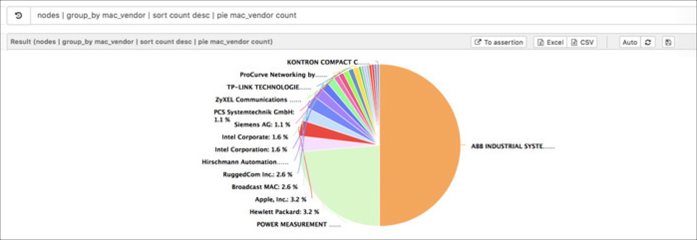
Pie chart
An example on how to create a pie chart to understand the media access control (MAC) vendor distribution in a network.
We choose nodes as our query source and we start to group the nodes by
mac_vendor:
nodes | group_by mac_vendorWe can see the list of the vendors in our network associated with the occurrences count.
To better understand our data we can use the sort command, so the query
becomes:
nodes | group_by mac_vendor | sort count descIn the last step we use the pie command to draw the chart with the mac_vendor as a label
and the count as the
value.
nodes | group_by mac_vendor | sort count desc | pie mac_vendor count