Homepage
This is the default view in Vantage, it offers the highest level view of the health of your network.
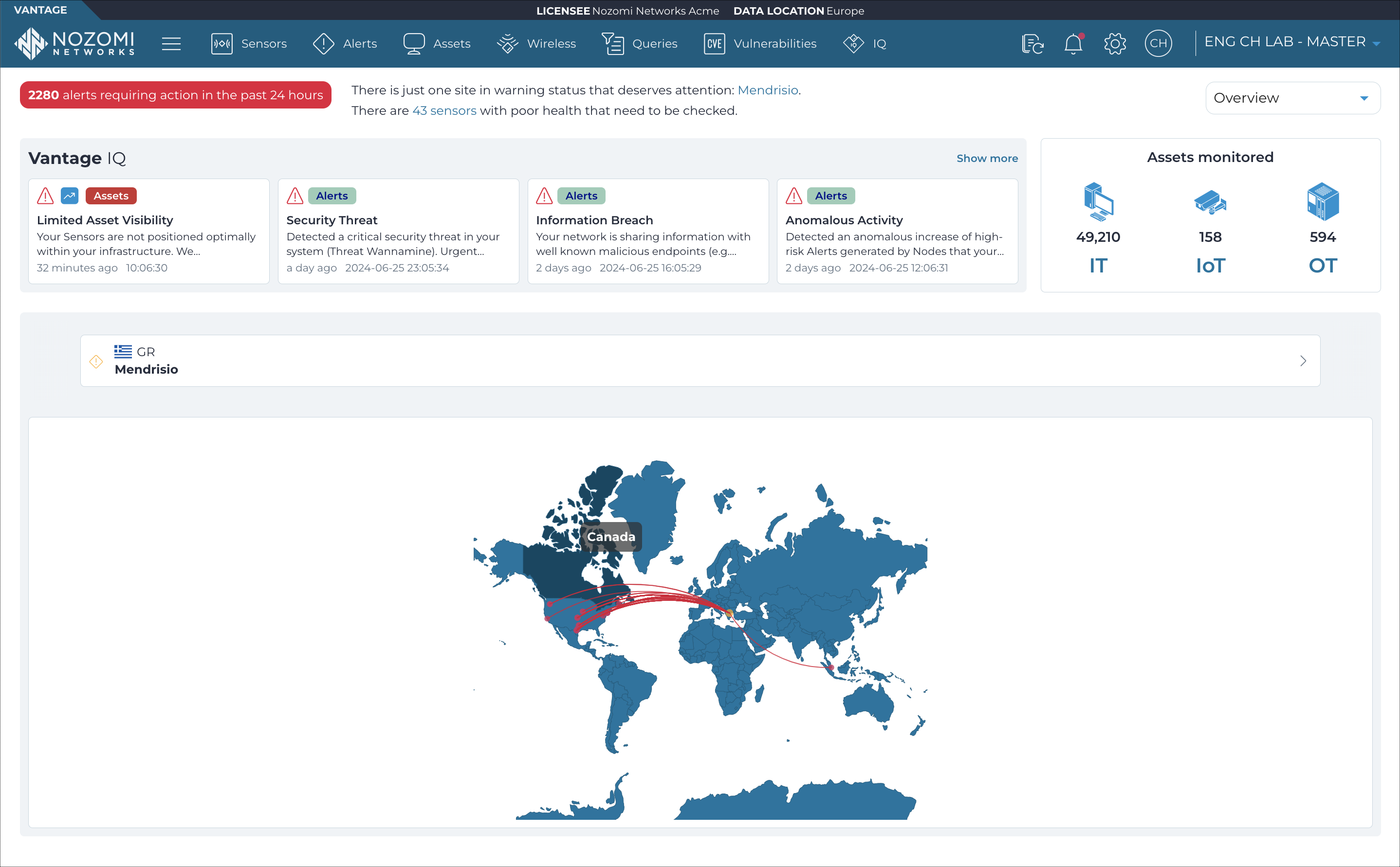
When you sign into Vantage, the Overview page highlights the health of the assets and sites that you monitor, and shows alerts and incidents.
Top navigation bar
For more details, see Top navigation bar.
Dropdown menu
- Overview: The default view in Vantage, it offers the highest level view of your network's health.
- Alerts: Displays the total number of alerts across your entire network. The map shows the locations of the top alert types and protocols shown in the charts at the bottom of the page.
- Assets: Displays the total number of assets across your entire network. The map visualizes the locations of the top asset types, vendors, and operating systems shown in the charts at the bottom of the page.
- Sensors: Displays the total number of sensors connected to Vantage. The map visualizes the locations of the top sensor models shown in the chart at the bottom of the page.
- Traffic: Displays the total throughout in Mbps (megabits per second) and number of links across your entire network. The map visualizes the origin locations of links, while the list at the bottom of the page shows the top destination country.
- Vulnerabilities: Displays the total number of vulnerabilities detected in your network. The map visualizes the locations of the sites with the highest number of vulnerabilities, while the list at the bottom of the page shows the most common categories.
Assets monitored
- Mac address
- Vendor
- Protocol
- Type
Carousel
The carousel shows a quick view of your sites.
Map
The map helps you visualize your network and its health, and let you quickly understand where to focus your attention. Vantage draws lines across the map to depict the location of threat actors and the sites that their attacks target. You can select a site on the map to view it on the carousel. Use the 2D and 3D buttons to switch between flattened and spherical views of the Earth.
Elements
Common user interface (UI) elements are used in the different pages and sections.
Time groups
The Time groups button displays a throughput view of the data over a given time period.
Columns
The Columns button lets you select which of the available columns for the current page will show.
Refresh
The Refresh
![]() icon lets you immediately refresh the current view.
icon lets you immediately refresh the current view.
Live
The Live
![]() toggle lets you change live view on, or off. When live
mode is on, the page will refresh periodically.
toggle lets you change live view on, or off. When live
mode is on, the page will refresh periodically.
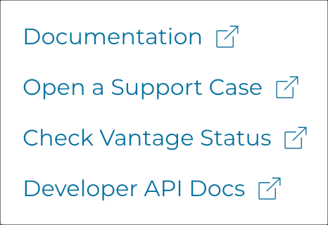
Support